
One React component library, three design concepts — switch the whole look with a single prop.


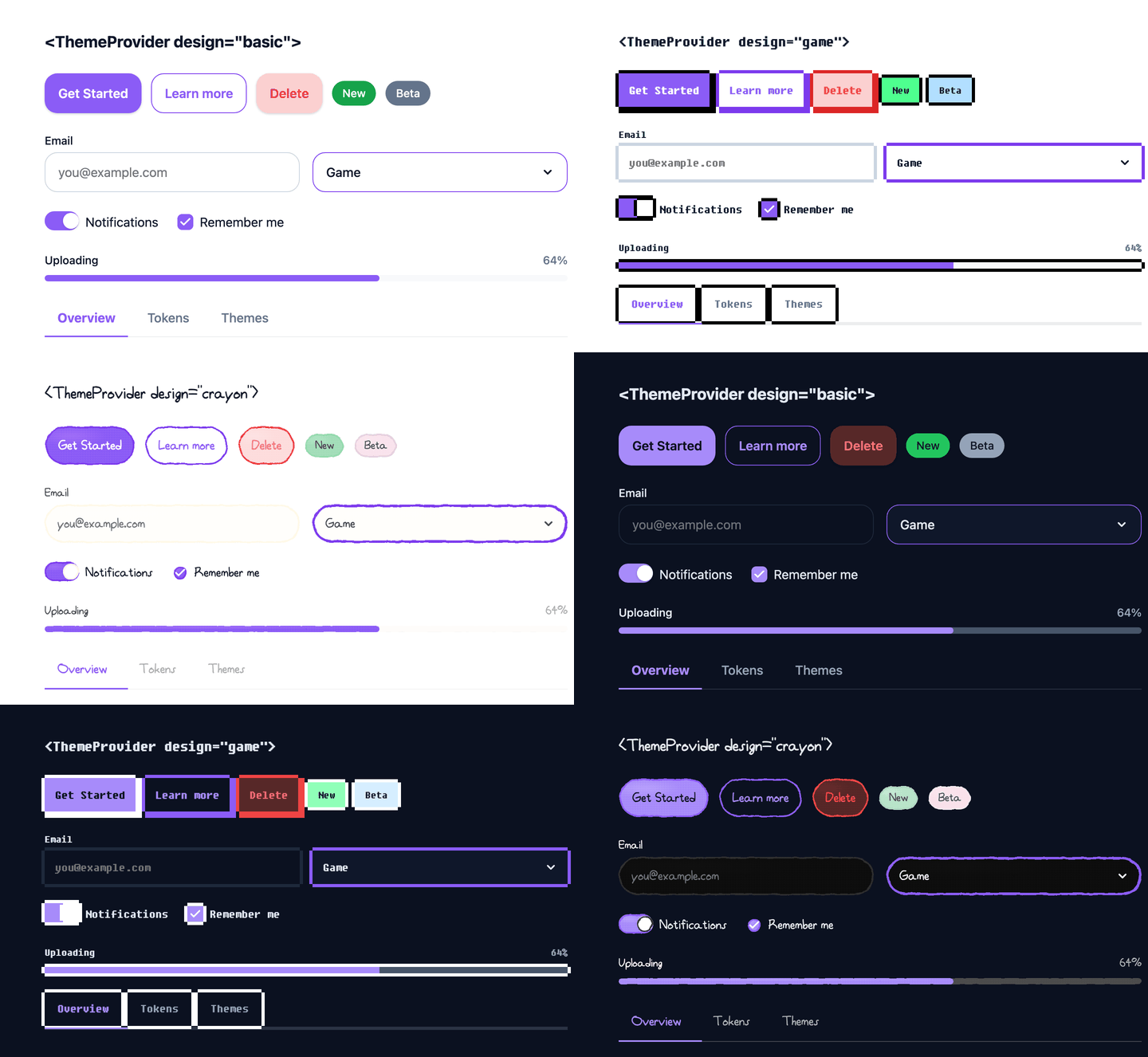
- Three design concepts —
basic,game(pixel art), andcrayon(hand-drawn), switched with onedesignprop - Light & dark mode — Every design ships both modes, with optional OS sync
- Token-driven — Components only read semantic tokens, so a design swap never touches your code
- Accessible by default — Built on Base UI headless primitives for keyboard and screen reader support
- Zero-runtime CSS — Styles compiled ahead of time with Vanilla Extract
- Small by default — Only the basic design's CSS loads up front; game and crayon CSS load on first use
- Server Component friendly — Client entry is marked
"use client", and a React-free/tokensentry is safe in server-only code - TypeScript native — Typed props with JSDoc on every component
npm install pine-design-system
# or
pnpm add pine-design-system
# or
yarn add pine-design-system
Requires React 18 or 19.
Wrap your app with ThemeProvider and import the stylesheet once:
import { ThemeProvider, Button, Badge, TextField } from "pine-design-system";
import "pine-design-system/style.css";

function App() {
	return (
		<ThemeProvider defaultDesign="basic">
			<Button intent="primary">Get Started</Button>
			<Badge intent="success">New</Badge>
			<TextField label="Email" placeholder="you@example.com" />
		</ThemeProvider>
	);
}The core idea of Pine: change the design, keep the code. Every component reads the active design from ThemeProvider.
| Design | Look |
|---|---|
basic |
Clean and modern, with soft shadows — for product and business apps |
game |
Pixel-art frames, pressable arcade buttons, and a bitmap font |
crayon |
Hand-drawn strokes and a handwritten font — for playful or learning apps |
<ThemeProvider design="game" theme="dark">
	<YourApp />
</ThemeProvider>
Switch at runtime with controlled props:
import { useState } from "react";
import { ThemeProvider, type Design, type Theme } from "pine-design-system";

function App() {
	const [design, setDesign] = useState<Design>("basic");
	const [theme, setTheme] = useState<Theme>("light");

	return (
		<ThemeProvider design={design} onDesignChange={setDesign} theme={theme} onThemeChange={setTheme}>
			<YourApp />
		</ThemeProvider>
	);
}
Or from anywhere inside the provider with useThemeRequired():
import { useThemeRequired } from "pine-design-system";

function DesignToggle() {
	const { design, setDesign } = useThemeRequired();
	return <button onClick={() => setDesign(design === "game" ? "basic" : "game")}>Toggle</button>;
}
The game and crayon stylesheets (style-game.css, style-crayon.css) are loaded by ThemeProvider the first time you switch to them. While one loads, cssLoading from the theme context is true. They load through your bundler (Vite, webpack, Next.js), which also emits their fonts, so there are no font files to copy or serve yourself. To skip the lazy load, import one up front, e.g. import "pine-design-system/style-game.css".
| Prop | Type | Default | Description |
|---|---|---|---|
defaultDesign |
"basic" | "game" | "crayon" |
"basic" |
Initial design (uncontrolled) |
design |
"basic" | "game" | "crayon" |
— | Design (controlled), use with onDesignChange |
defaultTheme |
"light" | "dark" |
— | Initial color mode, used when syncWithSystem is false |
theme |
"light" | "dark" |
— | Color mode (controlled), use with onThemeChange |
syncWithSystem |
boolean |
true |
Follow the OS color scheme until the theme is set manually |
primaryColor |
string |
— | Hex color that generates a custom primary palette (e.g. "#6366f1") |
Render one ThemeProvider at the root. To show another design or mode in part of the page, nest a ThemeProvider inside it: the outermost provider puts the theme class on <html>, and nested ones only theme their own subtree. The applyGlobal prop is deprecated and will be removed in the next major version.
| Component | Description |
|---|---|
| Badge | Status labels and counts |
| Button | Actions in solid, outline, ghost, and weak variants |
| Checkbox | Selectable input with label |
| Dialog | Modal dialog with title, description, and action buttons |
| Dropdown | Select input with anchored popup (side, align, sideOffset) |
| ProgressBar | Determinate and indeterminate progress with accessible value text |
| Switch | On/off toggle |
| Tab | Tabbed navigation with accessible panels |
| Text | Typography primitive with size, weight, and intent |
| TextField | Text input and textarea with validation states |
| Tooltip / TooltipProvider | Hover and focus popups, with shared open delay for groups |
Most components share the same vocabulary of props:
intent—primary | secondary | success | warning | danger | neutralsize—small | medium | large(plusxlargeonButton)rounded—small | medium | large(largeis a full pill; ingamethe steps notch the pixel frame's corners)className— merged with the component's own classes
See the documentation for every prop and live examples.
The main pine-design-system entry is a client boundary ("use client"), so you can render its components from Server Components as usual.
For server-only code (a Server Component's function body, Route Handlers, generateMetadata), import design tokens from the React-free /tokens entry:
import { colors, radius, spacing } from "pine-design-system/tokens";To avoid a light/dark flash before hydration, inline getThemeInitScript() in your root layout:
// app/layout.tsx
import { getThemeInitScript } from "pine-design-system/tokens";

export default function RootLayout({ children }: { children: React.ReactNode }) {
	return (
		<html lang="en" suppressHydrationWarning>
			<head>
				<script dangerouslySetInnerHTML={{ __html: getThemeInitScript({ design: "basic" }) }} />
			</head>
			<body>{children}</body>
		</html>
	);
}The package ships llms.txt and llms-full.txt (also inside node_modules/pine-design-system/), so coding agents can read the full component API without leaving your project.
- React 18 / 19
- Base UI — Headless, accessible primitives
- Vanilla Extract — Zero-runtime CSS-in-TS
- TypeScript
- Vite — Library build
Contributions are welcome! To run the project locally:
git clone https://github.com/3o14/pine-design-system.git
cd pine-design-system
pnpm install
pnpm run storybook   # Storybook on http://localhost:6006
pnpm run test # Vitest- Fork the repository
- Create a feature branch (
git checkout -b feat/amazing-feature) - Commit your changes (
git commit -m 'feat(Button): add amazing feature') - Add a release note with
pnpm changeset - Open a Pull Request